BRAND GUIDELINES
Our Brand
Guidelines
A clear guide to using the Internwise brand consistently across all platforms.
Internwise is an online job board platform for the niche of internship recruitment. Our vision is to help reducing youth unemployment rates by directly connecting Employers and Candidates in the UK.
 Empowering
Future Talent ↗ Opportunities
People
Growth
A Brighter UK
Our Logo
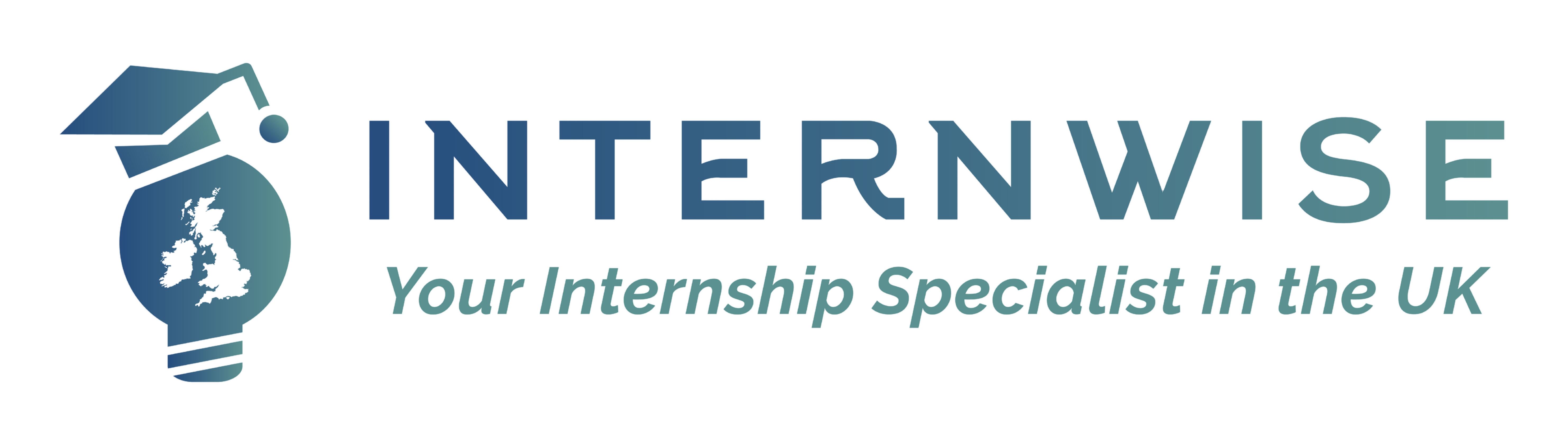
Our logo represents learning, opportunity and a brighter future. It combines a graduation hat, a lightbulb and a map of the UK, reflecting our mission to connect talented candidates with great employers.
Horizontal Logo
Use the horizontal version where vertical space is limited.
Brand Colours
Our colour palette reflects trust, growth and opportunity. Please use the following colours consistently across all materials.
#264D7E
R 38 G 77 B 126
Trust, stability and professionalism
#5B9291
R 88 G 146 B 145
Growth, opportunity and success
#FFB120
R 255 G 177 B 32
Energy, optimism and action
#333333
R 51 G 51 B 51
Text, contrast and balance
Logo Usage – Do’s and Don’ts
To maintain a strong and consistent brand identity, please follow these guidelines.
Use approved logo versions
Don’t change the colours
Don’t stretch or distort
Don’t remove the icon
Don’t use on busy backgrounds
Social Icon Construction
Social media icons are individually designed based on specifications. Always align the logo centered both vertically and horizontally to maintain a consistent and professional look.
Key Guidelines
Keep the logo clear and legible
Maintain proper spacing
Use approved colour variations
Keep the icon centered
Follow the minimum size requirements
Need Internwise Brand Materials?
If you require Internwise logos or other brand assets, please contact us and we'll be happy to provide the appropriate files.


